The Brief
To conduct usability tests on Supremenewyork.com with a view to creating a redesign, then A/B testing to test whether the redesign has improved usability.

The Approach
Working in a group to run initial usability tests and share findings, before working on a redesign and A/B testing individually over a 7 week period.
Supremenewyork.com was evaluated in relation to the following:
Heuristics: Using Nielsen and Molich's heuristics, and IBM's accessibility heuristics.
Accessibility: Using WCAG 2.1 requirements, Levels A, AA and AAA.
Performance: Comparing metrics against another retail website; 1) time taken to complete each task, which shows the effort required to complete it, 2) task success for each task, which shows the ability to complete it, 3) errors made on each task, which shows efficiency, and 4) lostness over the whole task scenario, which also shows efficiency.
Satisfaction: Using 'Think Aloud' methods then thematically analysing the transcripts. Using SUS scores to compare against other retail websites.
Biometrics: Using eye tracking software.
Psychology: Using psychological principles of UI design, such as mental models, Gestalt's principles and information scent.
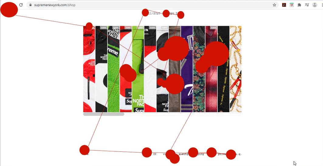
Shop Homepage scan path
Key Findings
- The unconventional journey through the website is very confusing to users.
- The lack of return/back button does not allow users to correct any mistakes.
- The lack of search bar is missed by users, reducing their ability to navigate the site.
- The size guide requires the user to remember the product name in order to find the relevant size chart.
- The homepage 'stripes' make it hard to see the garments.
- Sizing and delivery information is hard to locate and the page layouts are confusing.
Redesign
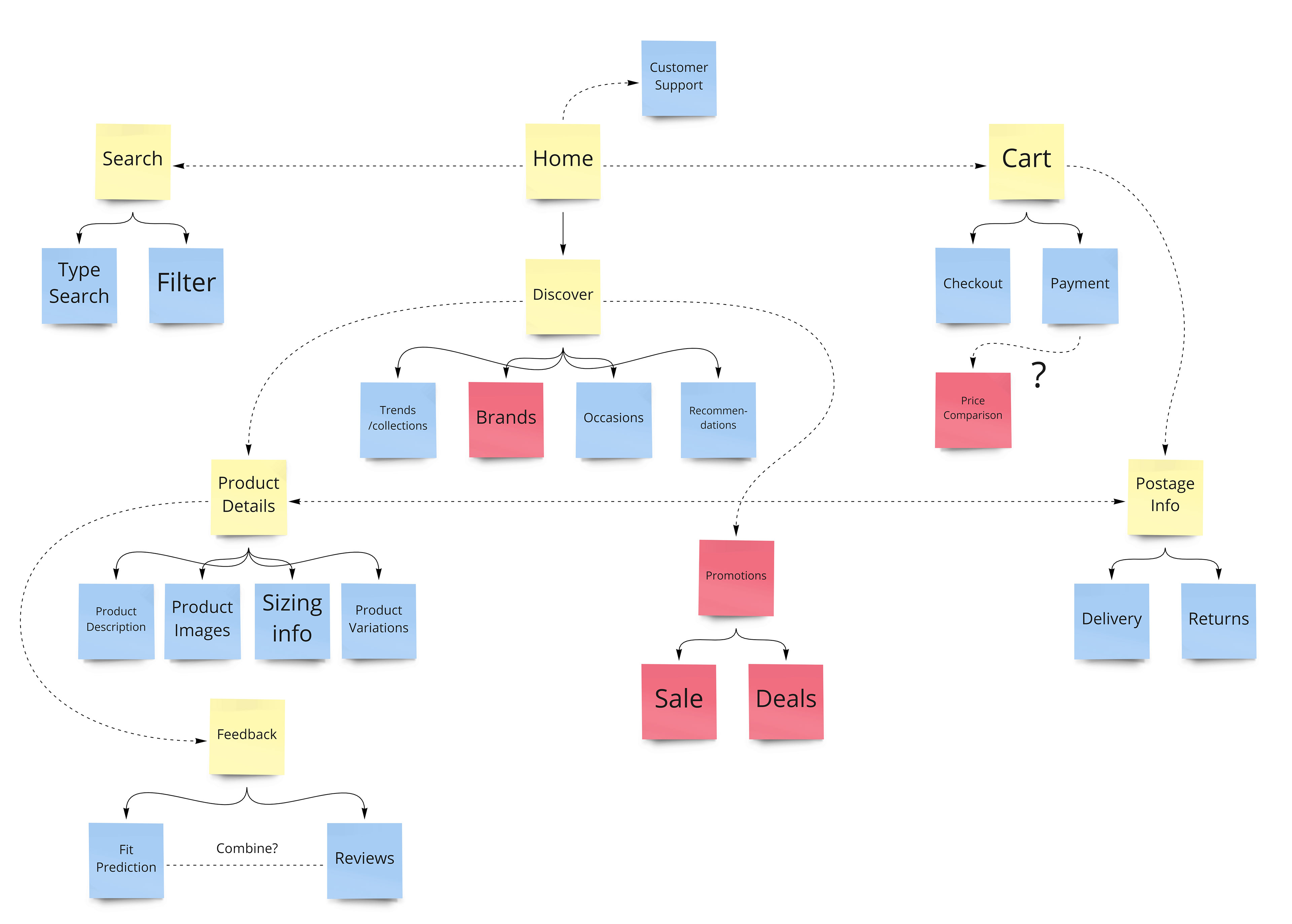
Supreme redesign layout.
The most critical issue to be addressed was the overall site layout, as navigation was the biggest problem for users. The new layout was informed by a card sorting activity completed by the class, where top tasks were grouped into categories that made sense to users.
Red notes below denote features deemed irrelevant to the Supreme website. For example, Supreme does not offer any sales or promotions so those sections are not needed.
Other changes made include:
- More accessible colour combinations and font sizes.
- Adding text alternatives to images.
- Adding a search bar and return button.
- Placing garment information in an accordion menu on the product page.
- Making garments more visible on the homepage, using a carousel.
- Making the size guide and delivery information more legible.
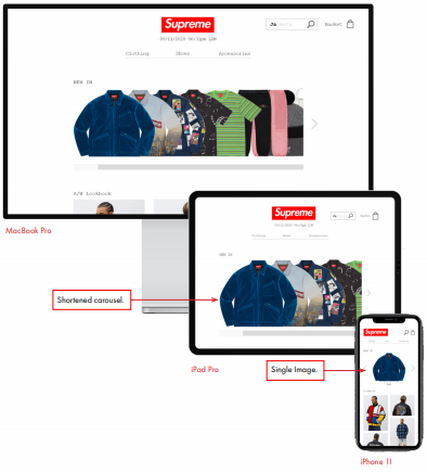
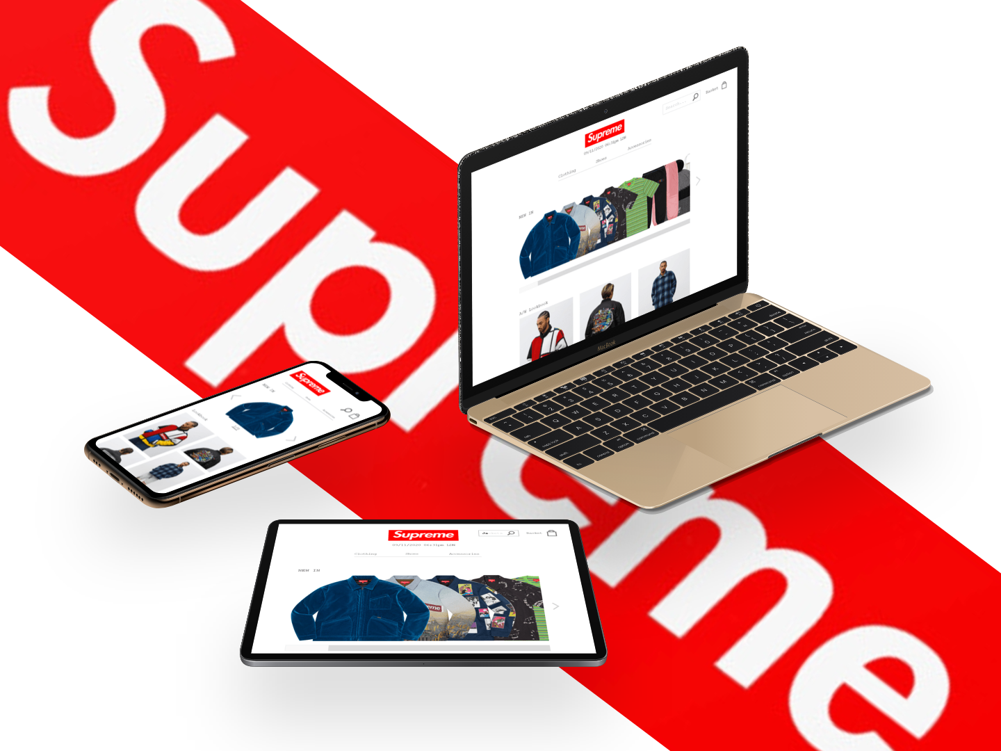
- Creating a responsive design that works on all screen sizes.
Shop Homepage Redesign
Category Page Redesign
Product Page Redesign
A/B Testing
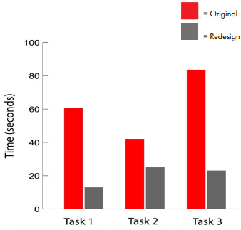
Performance: Three tasks were completed by participants on the Supreme website and the time taken to do each was recorded. The same tasks, listed below, were completed on the redesigned site and the times were compared.
1) Using the Supreme website, find a jacket to wear to a friend’s birthday party. (Filtering by size, colour etc if possible)
2) On the product page, look at the photos and check that this jacket suits your style. Look at the product description and read some reviews.
3) Locate sizing/fit guides to check which size you should buy, then find out delivery and returns information.
Mann-Whitney U-tests showed a significant difference between times for tasks 1 and 3, meaning that the redesign is easier and quicker to use.
Task success, errors made and lostness was also recorded, with the redesigned site performing better on all tests.
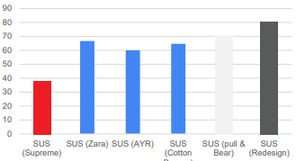
Satisfaction: SUS scores were produced by putting statements into a questionnaire with a standard 5-point Likert scale ranging from ‘very dissatisfied’ to ‘very satisfied’, and asking participants to interact with the prototype.
Example statements: I think that I would like to use the system frequently, I found the system unnecessarily complex, I felt very confident using the system.
The overall SUS score was calculated and compared to the original Supreme website's score, as well as the scores of other online retailers. The redesigned site's score is double that of the original site, so is a great success.
Reflection
If I did the redesign again I would do so using a responsive grid system. Some of the criticisms of the original site related to a lack of responsiveness, and I do not think I successfully addressed all these issues in the redesign.
Other parts of the prototype’s design were also not perfect. During the ‘Think Aloud’ exercise, done as part of A/B testing, participants commented that some of the text on the delivery page was too small.
The possibility to enlarge garment pictures was also not signposted enough; some participants struggled to find this feature. Adding a magnifying glass icon could help with that.
However, overall the evaluations of Supreme and subsequent redesign were very successful. Many important usability and accessibility issues were identified through the evaluations and most were addressed in the redesigned prototype. A/B testing showed that the redesign was much more satisfying, efficient and effective to use than the original site.