Internal project
Publicis Sapient runs a Hackathon once a year for employees in graduate roles across the company.
Grads from PS's 53 offices worldwide take part in teams of five, working over 48 hours on a set brief to showcase their use of SPEED; Strategy, Product, Experience, Engineering and Data.
In 2023 I took part for the first time, and my team placed in the top three out of a total 78 participating teams. Woohoo!
The team
My team consisted of two front-end engineers, a back-end engineer, a product manager and myself - an experience designer.
The Hackathon provided me with the opportunity to be the design lead, facilitating creative workshops with the rest of the team and completing all the design deliverables on my own.
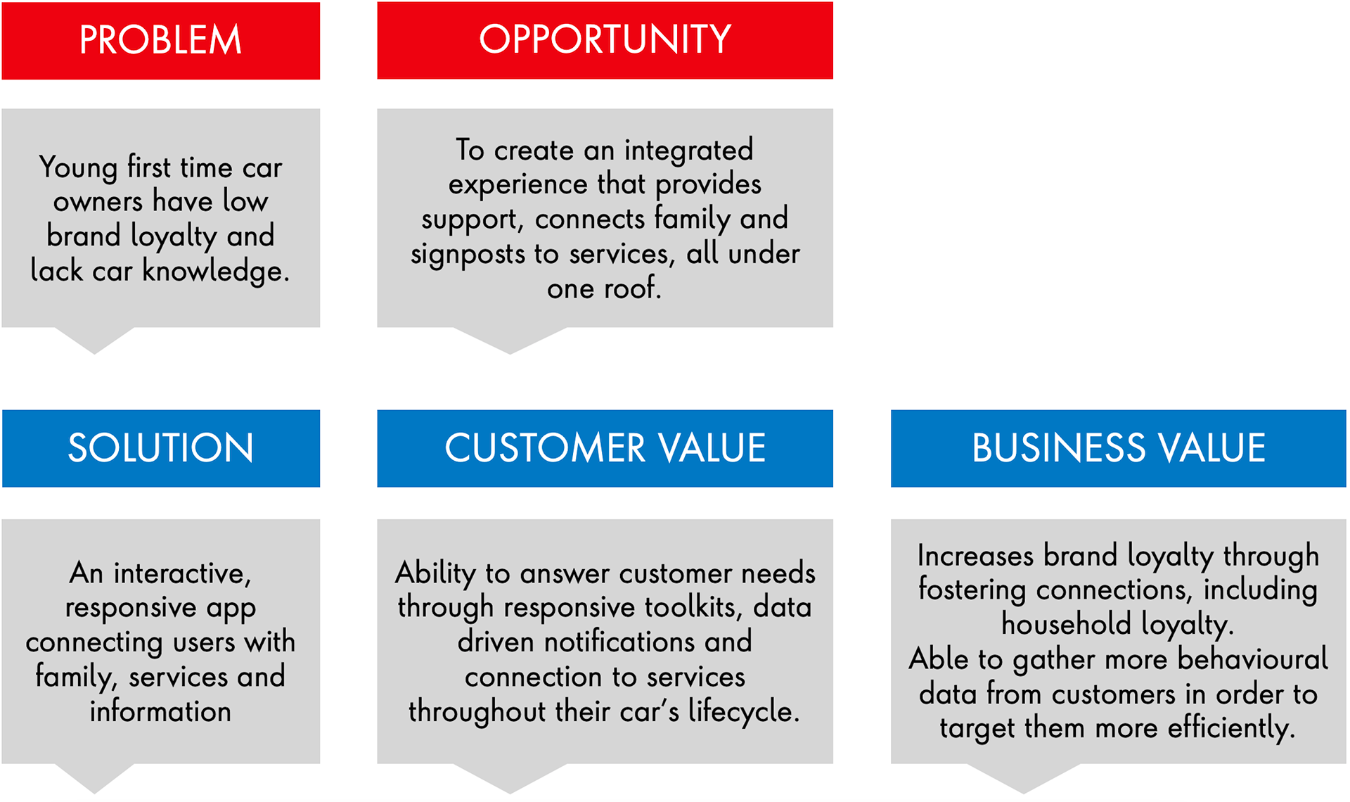
The brief: Drive lasting loyalty between customer and car
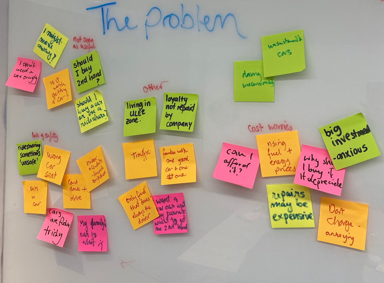
We began by researching around the brief; looking at the barriers to loyalty, customer behaviours and trends in the automotive industry.
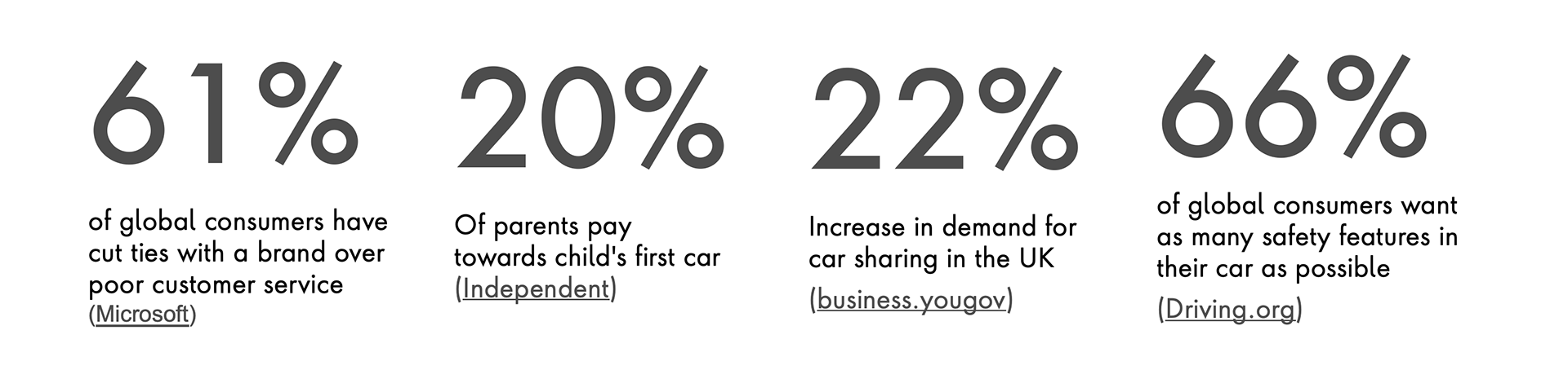
Key statistics
We identified first-time car owners as a potential target user, as they have no existing loyalties to a specific car brand.
We aim to capture these users early, satisfy their needs, fulfil painpoints and target with personalised marketing to generate future sales and drive loyalty based on high satisfaction levels.
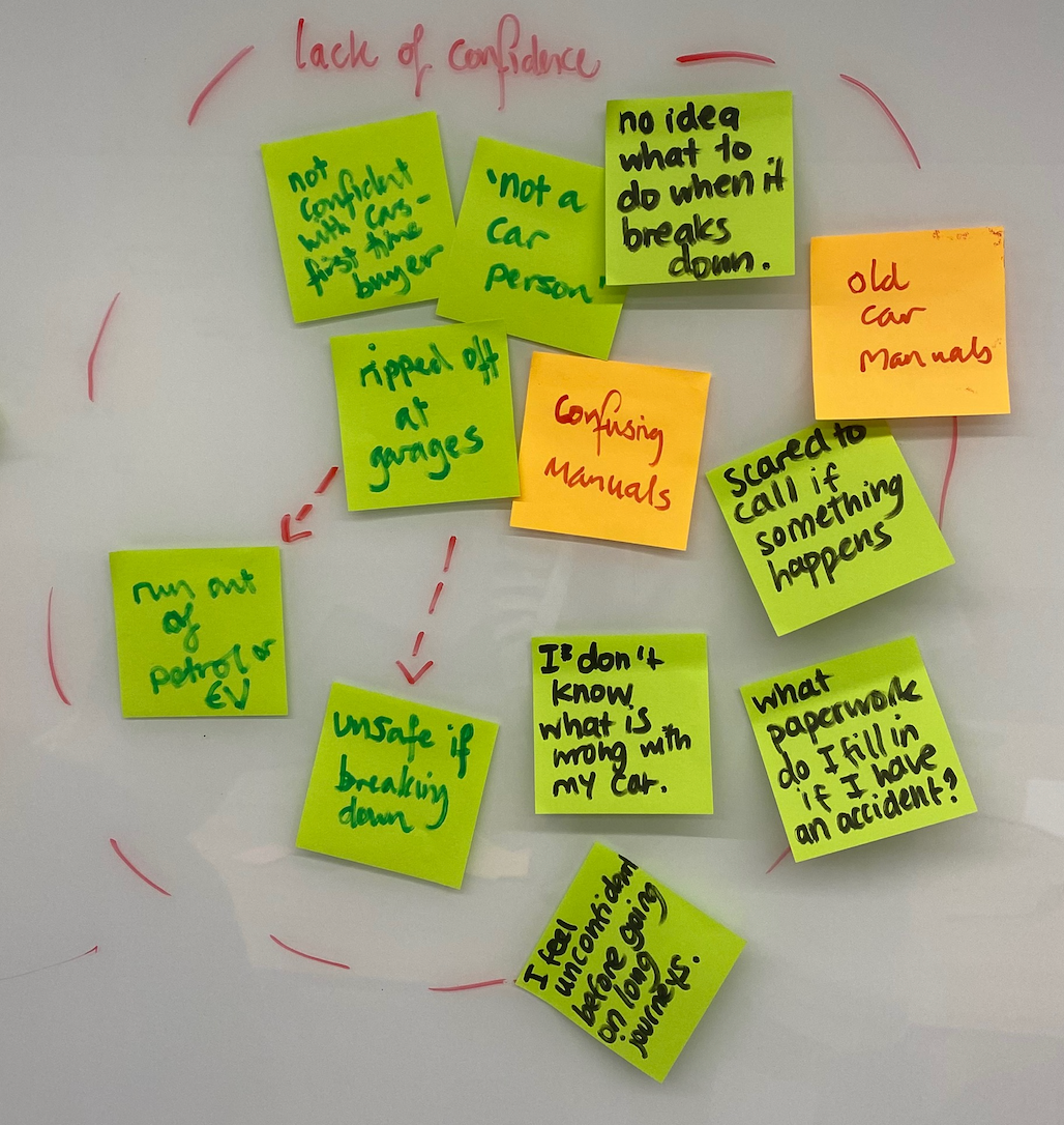
Problems for this user group were brainstormed into some main categories; including:
- Lack of confidence
- Safety concerns
- Lack of knowledge
Problem statement
First-time car owners aged between 18 and 24 waste time and money solving problems with their car and compromise on safety due to their lack of knowledge. This negatively impacts the user’s relationship with their car, as they don’t feel confident or in control of their car-ownership experience.
This user group is also highly influenced by their family's behaviour. A high proportion of first time car owners get financial help from their parents on the purchase, and many will learn to drive in, or borrow, a parent's car. When things go wrong while driving, family members are who our users will call first.
The client
As this is a speculative project, we were able to select an automotive brand to create our solution for. Based on the brief, problem statement and painpoints we aimed to solve for our user, Toyota was a good fit.
Road safety, safety awareness and education are key objectives for Toyota. They are also very family-focussed, with a dedicated family car range.
Kaizen, a philosophy of continuous improvement, is core to Toyota's brand and suggests that they would be open to an innovative new service offering.
Executive summary
Executive summary
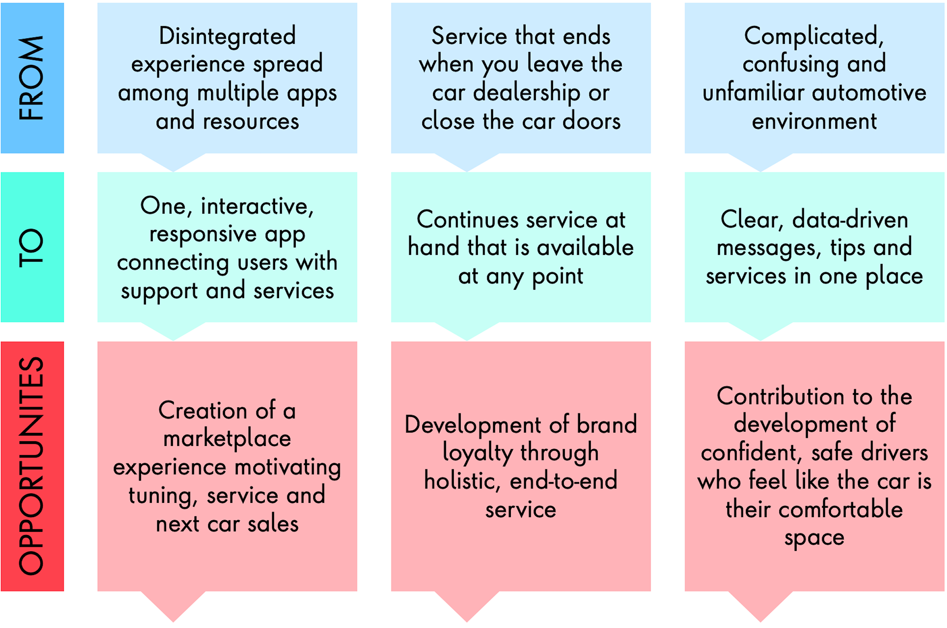
Opportunities
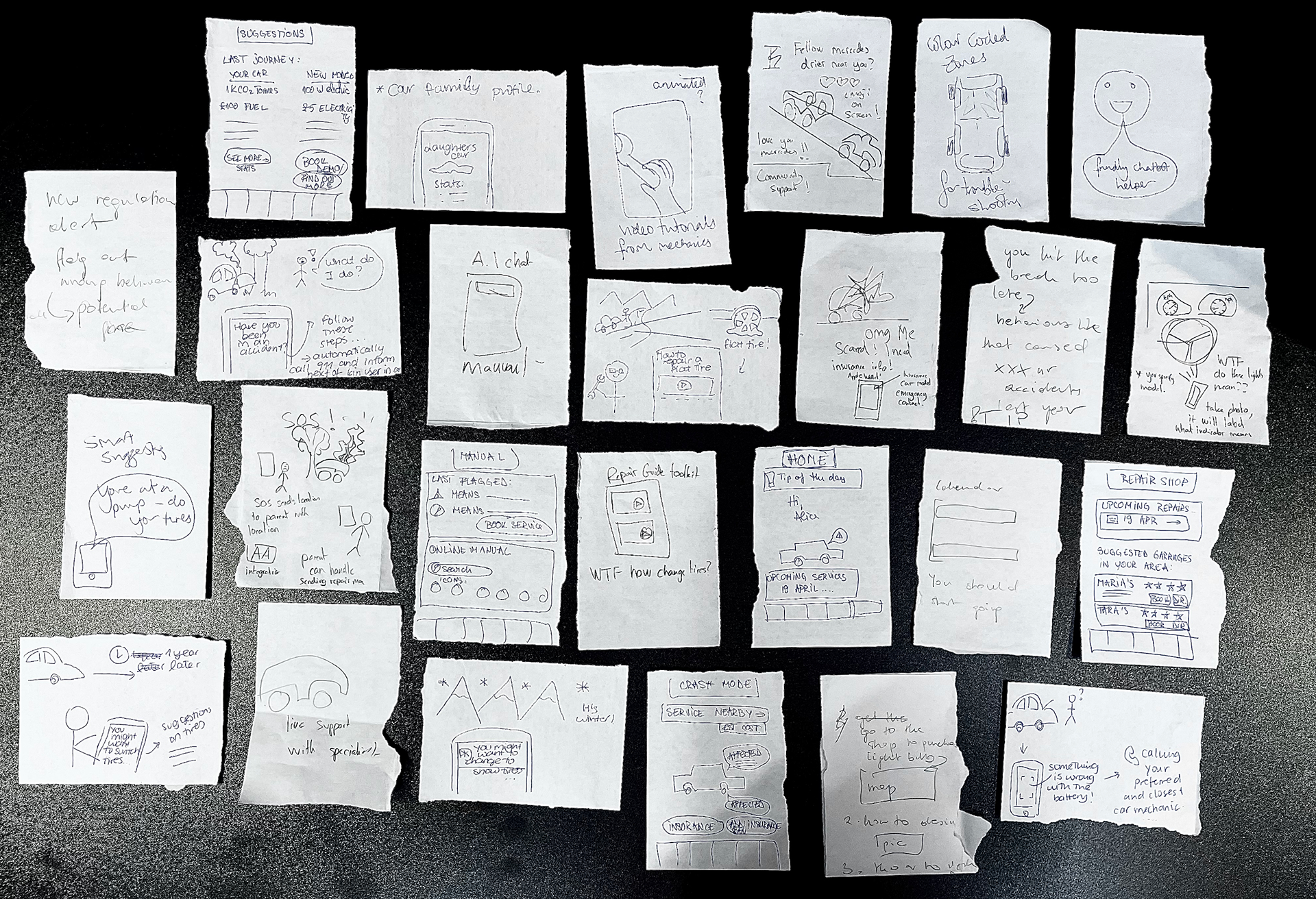
Ideation
Crazy 8 sketches
I facilitated an ideation session where how might we statements were created, voted on then used to create quick concept ideas.
Chosen HMW statement: How might we empower inexperienced new car owners to service their car themselves through personalised support, thus building a good relationship with their car and brand?
Key ideas:
- Smart notifications
- Repair tutorials
- Issue identifier
- Post-accident support
- Repair shop assistance/location
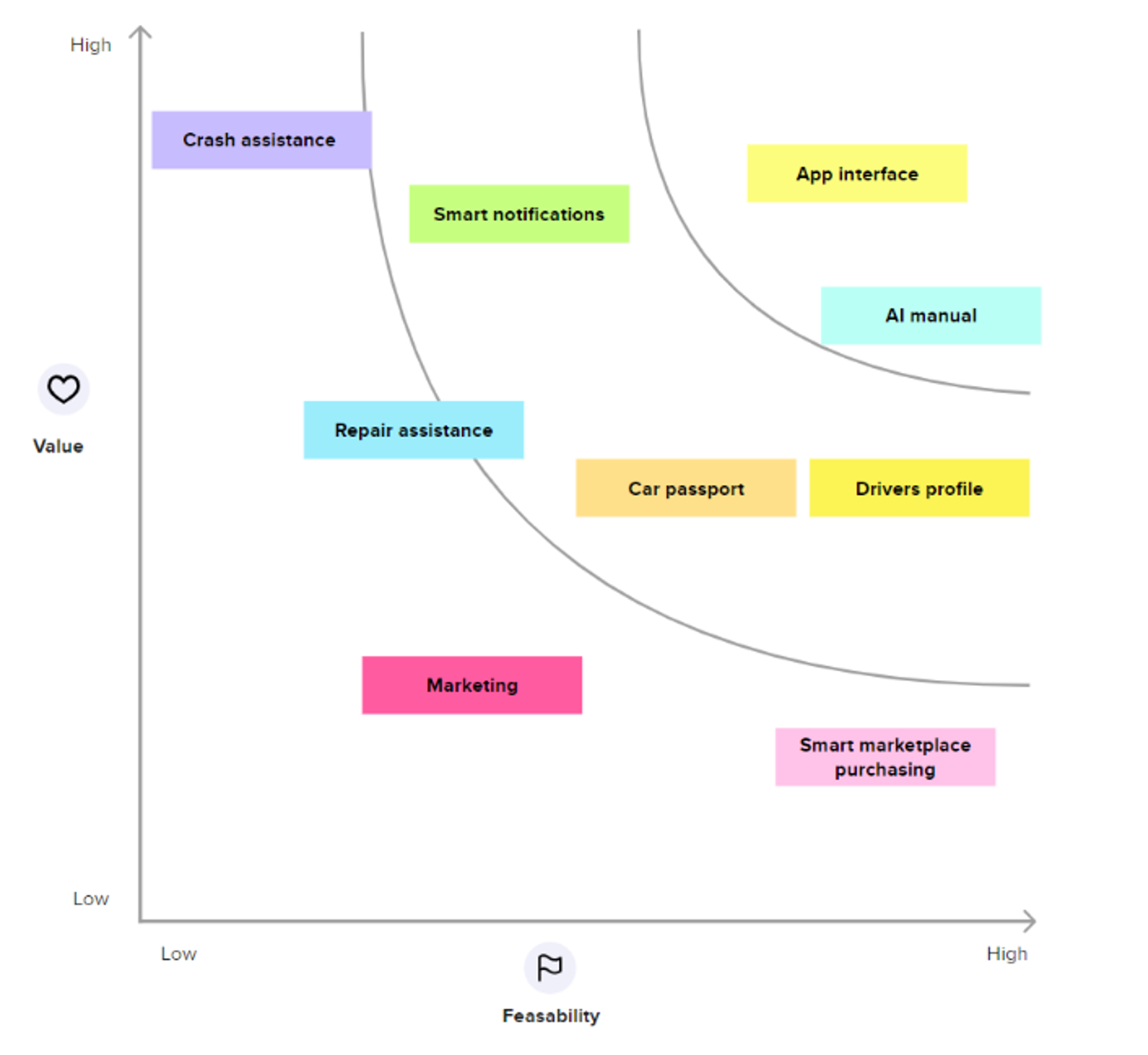
MVP feature prioritisation
Prioritisation of ideas was done as a team, based on a value/feasibility analysis. The MVP targets the ''easy gains''- characterised by high value and relatively low effort, due to the project's short time-frame.
Chosen features:
- App interface
- AI manual
- Car profile card, or 'passport'
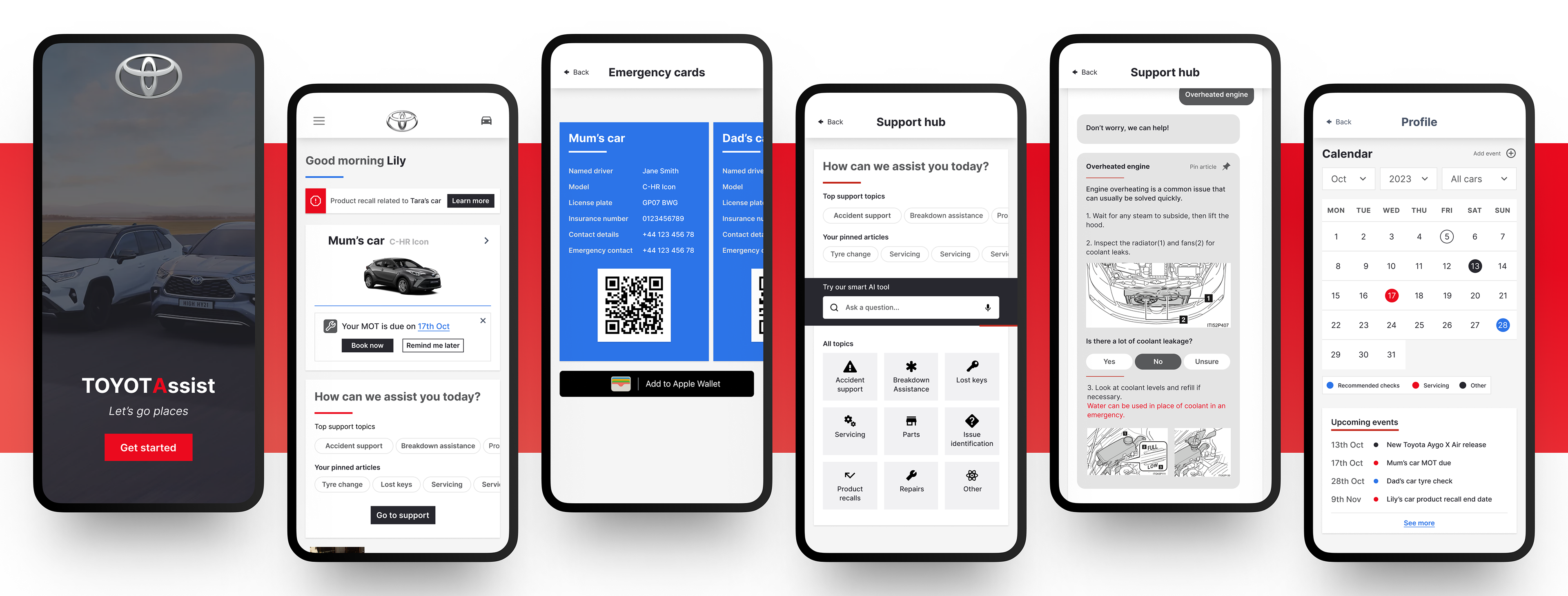
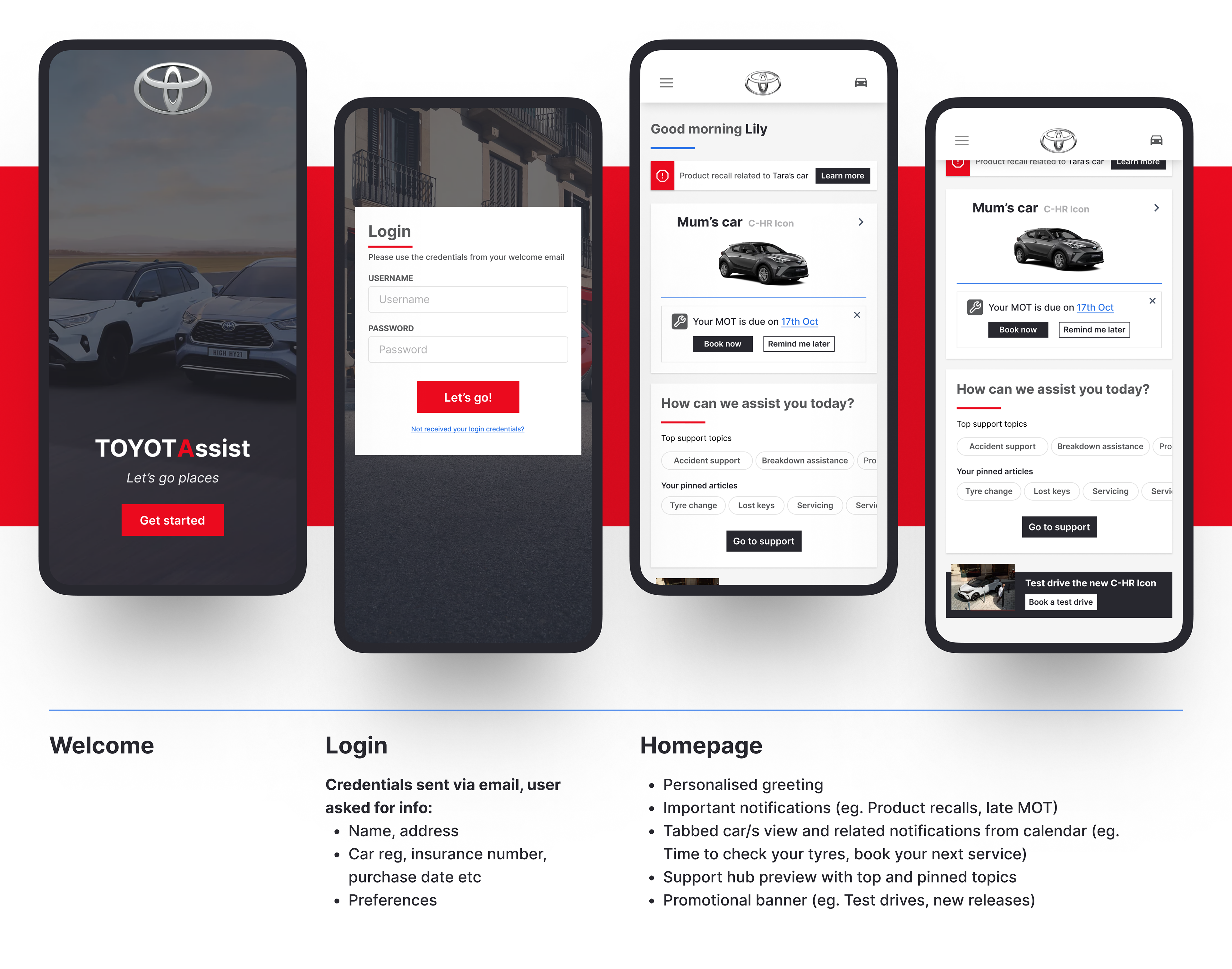
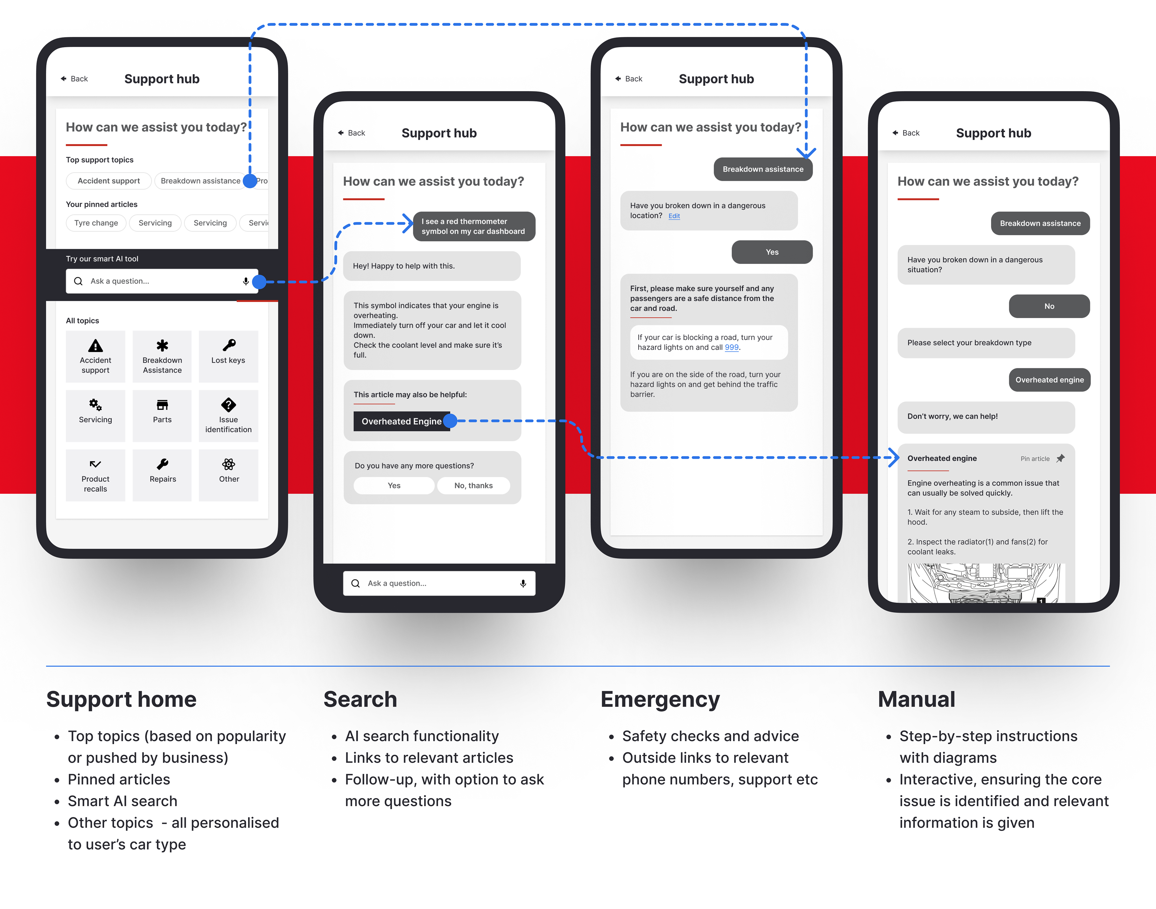
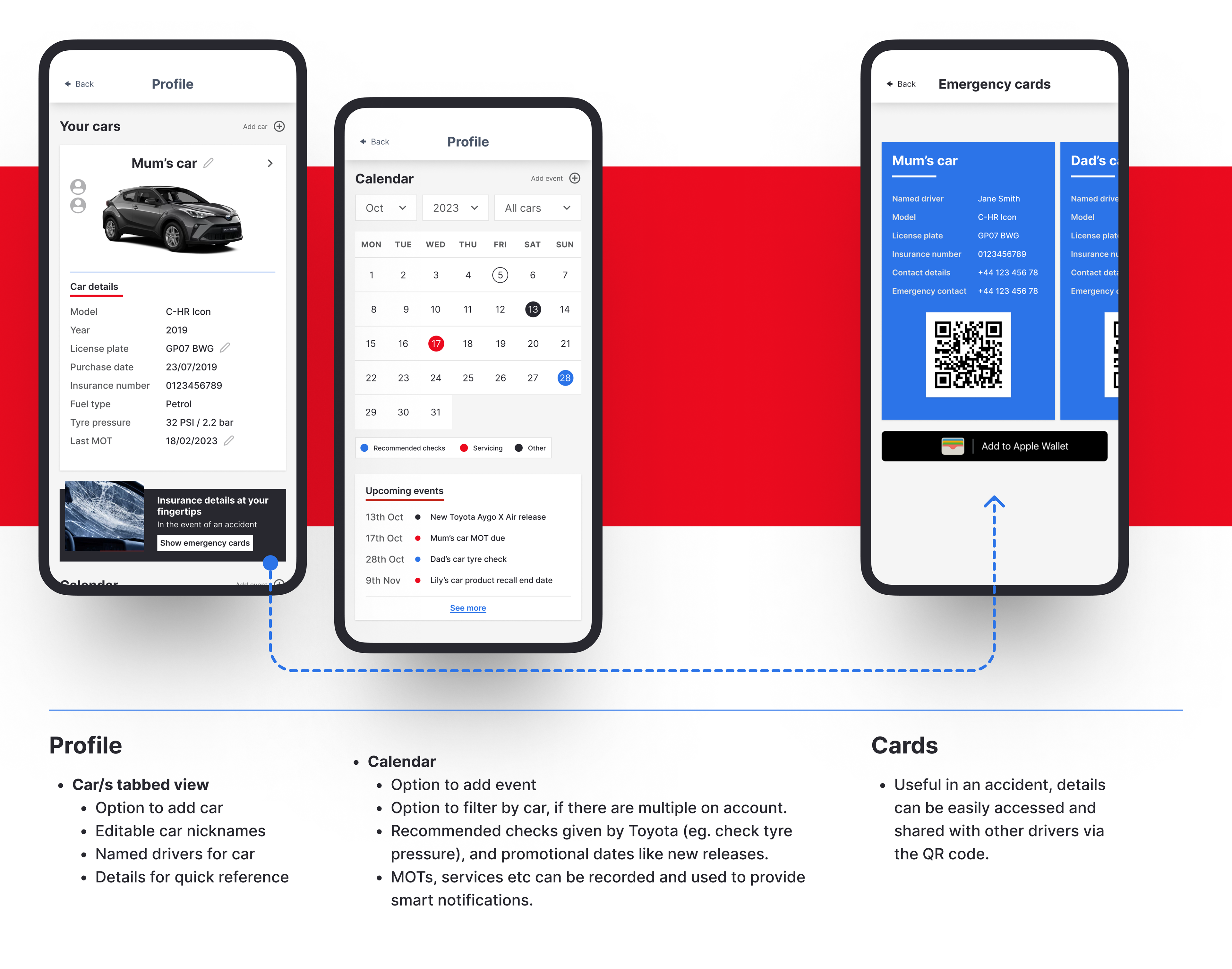
TOYOTASSIST
ToyotAssist is an AI-based experience for not only individual users but households, as environmental and economic concerns increasingly push individuals to share vehicles.
The solution will help with the execution of Toyota’s safety strategy, which extends beyond driving to safety awareness and education.
The AI manual and smart notification feature, combined with the modern safety technology embedded in Toyota’s cars, will contribute to positive change in drivers confidence, skills and behaviours on the road.
The app intends to incorporate marketplace characteristics connecting users to repair shops, road assistance, dealerships and Toyota’s Ebay shop.
Testimonials
''Tara was great at encouraging us to not focus on the development of the solutions during our ideation process and encouraged our creativity when it came to our brainstorming! ... The UI looked incredible, the pitch looked fantastic and the presentation we had to deliver at the end beautifully showcased our product.''
- Alice Pacuraru, Software Development Engineer on project