The Survivor Project is a domestic abuse charity based in Salford, Manchester. I interviewed the the charity's founder while conducting research for my masters major project then reconnected with them to offer a pro-bono website redesign through my current job.
The initiative
Since joining Publicis Sapient, I have been a member of a grad-run initiative called CodeAid. CodeAid's goal is to provide charities with digital transformation services, work we do part-time alongside our day jobs.
My connection with The Survivor Project meant I was keen to provide the charity with this service. A team of 3 PMs, 2 designers (including me) and 2 developers was made and over 10 months we worked closely with the charity's founder and volunteers to redesign their whole website.
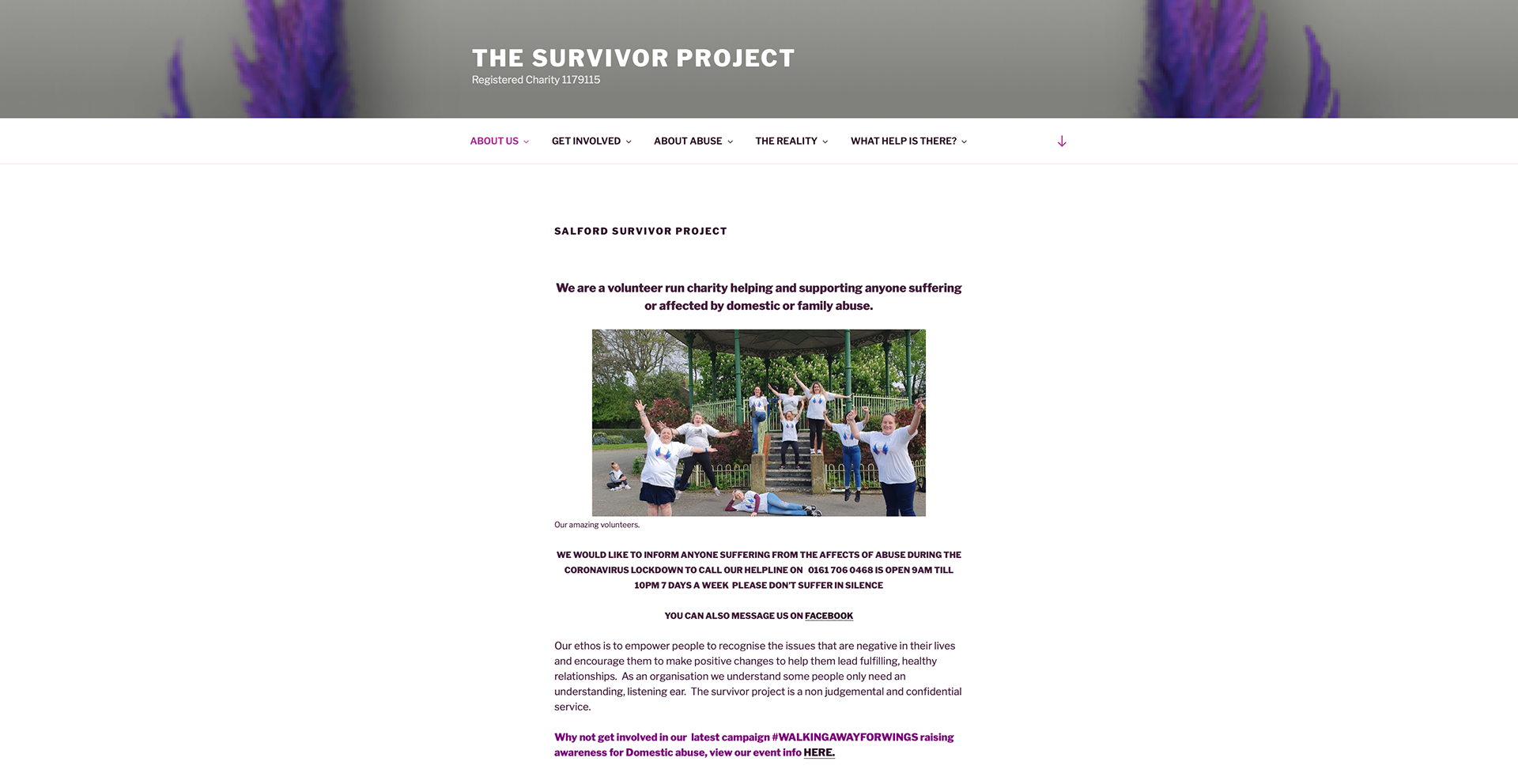
Existing homepage
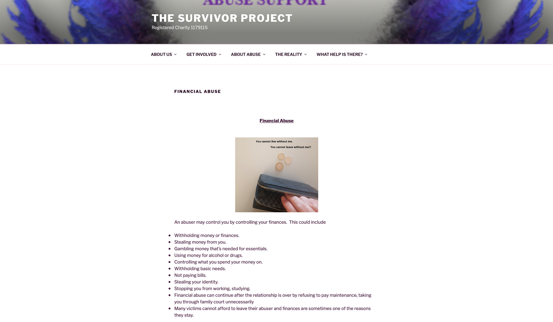
Existing abuse type page
The scope
The first step involved working with the client to identify areas where we could add the most value. The founder had built the existing website entirely by herself and the content was strong, she was just too busy to add all the features she wanted to. We conducted an audit of the existing site with the charity volunteers to find gaps and areas of improvement.
3 key areas were identified to focus on:
- Awareness-raising: Ensuring survivors can quickly access relevant information, no matter their experience. This was mainly done through development of a simple sitemap, informed by user journeys we mapped out.
- Charity representation: Highlighting the amazing work TSP does and the awards the charity has received.`
- Building support: Encouraging donations and drawing attention to volunteering opportunities.
We then worked with the charity's founder to prioritise some specific features:
- Quick escape: A button that takes a user from the TSP site to Google, in case they need to leave the site quickly in the presence of an abuser. I recommended this feature after researching other similar charity sites, and the client agreed it would be beneficial.
- Donation page: The existing site did not have an area for visitors to donate to the charity, relying instead on GoFundMe and similar platforms for fundraising.
- Helpline banner: TSP has a helpline for survivors needing advice, signposting or urgent assistance. We wanted to ensure that those at crisis point could easily find the helpline number on the site.
- Relatability counter: This idea came from wanting to foster a sense of community on the site, as experiencing abuse is incredibly isolating. The counter is located at the bottom of each abuse type information page, where users can anonymously indicate that they relate to the content of the page.
Often survivors are not aware that the abuse they are facing is common or even has a name (eg. financial, psychological), so this counter shows site visitors that they are not alone.
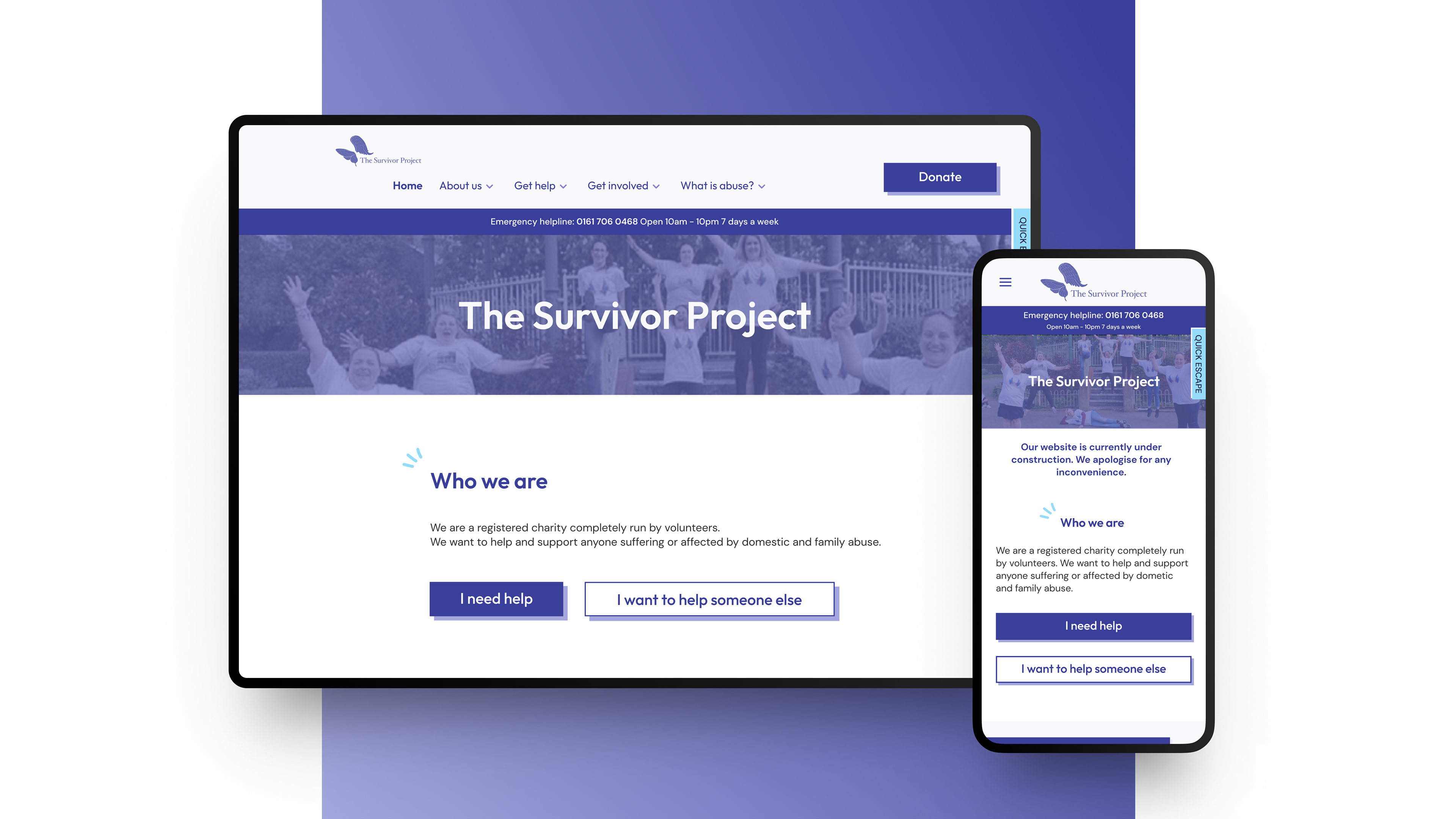
Redesigned navigation with new IA, banner, donate CTA and sticky quick escape button
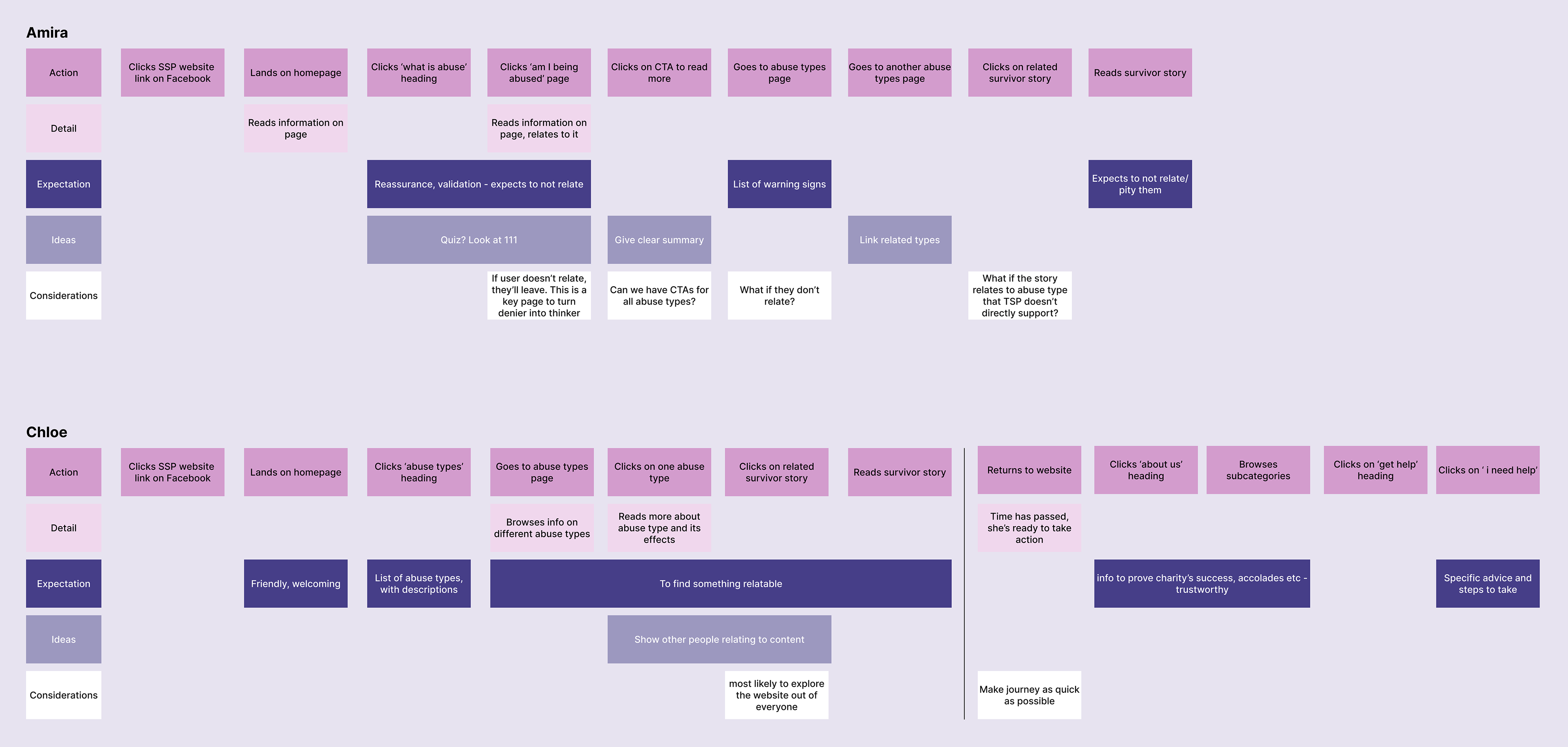
The Users
I researched domestic abuse as part of my masters so had a good knowledge of survivors going into this project. I used the personas I created then to explain different survivor types to my team so we could create valuable experiences for each.
We worked together to identify what success looks like for different survivor types:
Amira - unaware of abuse: Success is raising awareness, showing her relatable content so she can realise she is being abused and access support.
Chloe - contemplating: Success would be showing Chloe information that validates her suspicions, empowering her to seek support.
Sam - looking to leave: Sam needs crisis intervention to get them out of their abusive situation. Signposting must be clear and responses fast.
Karina - left and returned: Karina returned to her abusive partner and now needs help relating to the abuse, but feels she doesn't deserve support because she went back to them. She needs reassurance that help is always available.
User journey examples
Ideation
We worked in two week sprints to coincide with our bi-weekly client catchups, working on a page per sprint, validating wireframes with the client then creating high fidelity visuals for both in the next sprint. These were then handed over to the developers for implementation.
Copywriting was a significant part of my role at this stage. Many pages on the site were empty and needed content, and I reviewed and edited existing copy where needed too. This is not something I had done previously but I was keen to develop my skills in this area.
I defined some guidelines for myself around copywriting for survivors:
- Keep it gender neutral: Survivors and abusers can identify as any gender. Using gendered language could disempower survivors that do not see themselves represented in the website's copy.
- Frame it sensitively: Abuse is already a triggering topic, the site needed to strike the correct balance between being detailed and accurate without traumatising survivors further. There needs to be hope at the end of survivors' stories, for example, to show survivors that support is available and things can get better.
- Highlight the abusive behaviours: Survivors often blame themselves for the abuse they experience. I took care to frame abusive behaviours as what is happening to the survivor; eg. 'Does your partner throw objects at you?'. This is a fairly simple yes/no question that does not give survivors opportunity to make excuses for their partner's behaviour, hopefully raising awareness of what they are experiencing.
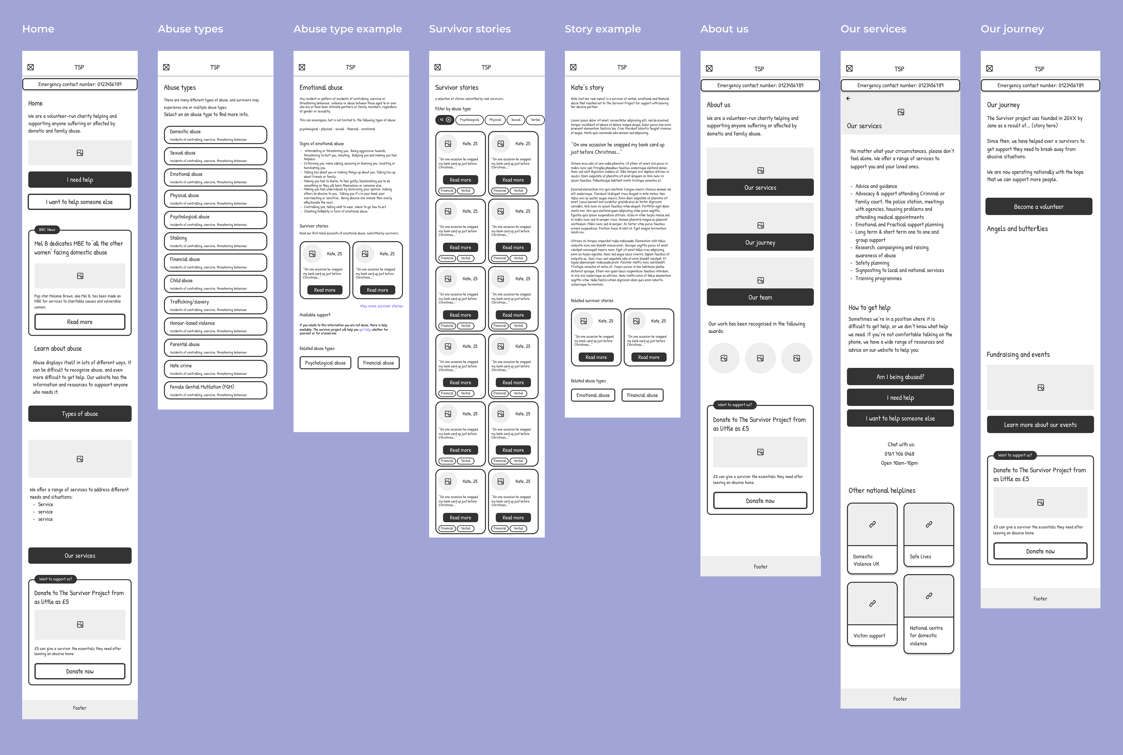
Wireframe examples of various pages
Visual design
Once wireframes were signed off by client, we began creating final visuals. The charity's founder had strong design ideas which we worked to incorporate, while maintaining clear and usable page layouts.
We redesigned the charity's logo too, drawing inspiration from an analogy coined by the founder; Butterflies inspired by Angels. Butterflies are a representation of abuse survivors and angels are those that have sadly passed. This imagery is core to the charity and we wanted to honour that in the design we created.
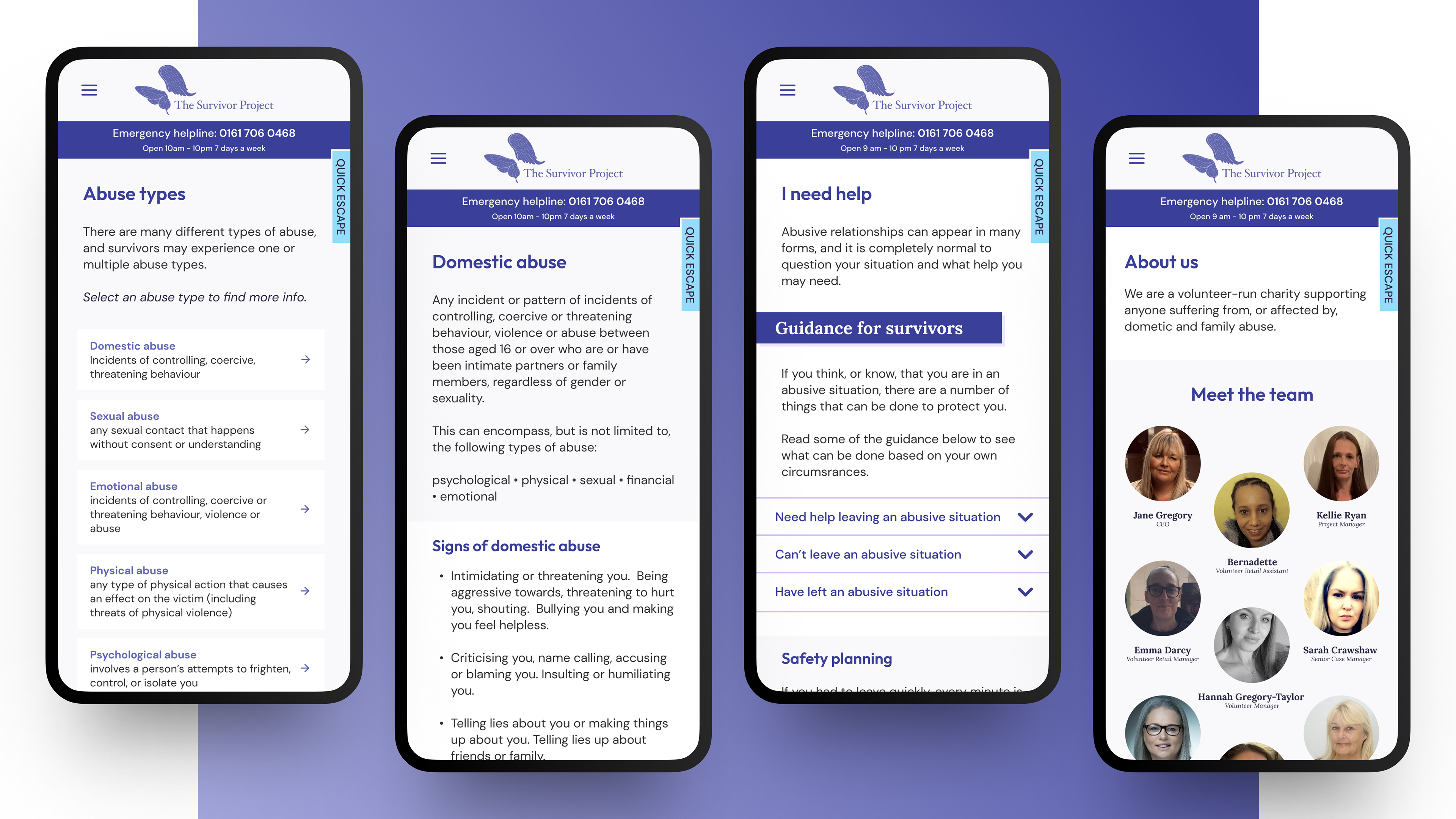
Visual design of various pages
Homepage redesign
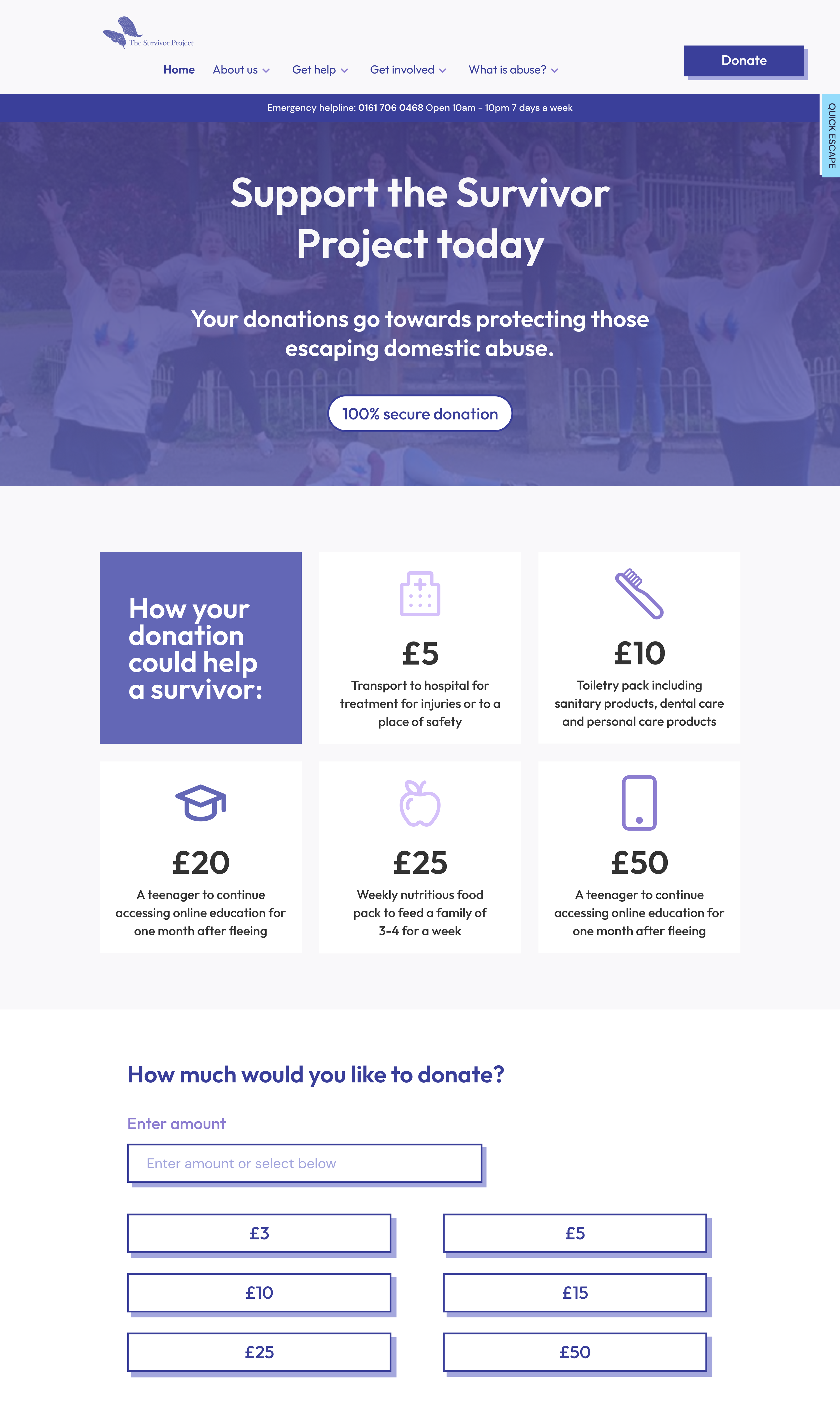
Donation page
Abuse type page with relatability counter
Next Steps
The design and development of the site are now complete. The website was created on WordPress, as that is the platform the charity used already, and a user guide was created to explain how the volunteers can edit content going forward.
The site has now been given to the founder for review, after which we will capture and enact any feedback. Then testing will be done with the volunteers before public launch, focussing on ease of navigation.
Testimonials
''From day one, Tara has shown great commitment and passion towards the project. From leading an awareness workshop based on her own research, to detailed archetype analysis, right through to wire framing and UI design, she has been proactive throughout the entire process.''
- Lilymae Prescott, Experience Designer on project